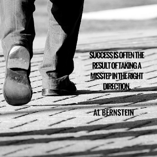
10 Mistakes People Make with Visual Content (plus 1 bonus)
| Tweet |
Lightning fast read meant to make you think...
10 Mistakes People Make with Visual Content (plus 1 bonus):
1. Overlook the magnitude of increase of interaction and social sharing when visual content is used (click on the visual on the left to see 23 retweets and 24 likes on Twitter).
2. Are afraid to make their own visual content.
3. Don't realize the tools available to create visual content (I like and use canva.com).
4. Overlook the importance of color combinations.
5. Have never had it enter their mind that they could come up with their own quotes and publish those? (this is one of mine: Harvest and Seeds).
6. Forget the importance of font color for clarity (notice this visual should have used a dark font).
7. Don't realize there are free pictures that are available on the web (e.g. unsplash.com, pixabay.com).
8. Forget they can search for any quote by any author or famous person via Google.
9. Don't take time to consider how others are doing it for inspiration (here are some more of mine: Euripedes quote, Robert Frost quote, Ann Frank quote, Your Greatest Asset, Top 10 Most Popular Halloween Candy).
10. Overlook that they don't have to include the same wording in the visual content as they do in the text of their tweet or Facebook status update (e.g. #Eiffel Tower #ParisAttacks).
BONUS Break copyright restrictions by scraping pictures from other websites to use as their own.
(Step via pixabay)

by Mike C (aka blog boy)
10 Mistakes People Make with Visual Content (plus 1 bonus):
1. Overlook the magnitude of increase of interaction and social sharing when visual content is used (click on the visual on the left to see 23 retweets and 24 likes on Twitter).
2. Are afraid to make their own visual content.
3. Don't realize the tools available to create visual content (I like and use canva.com).
4. Overlook the importance of color combinations.
5. Have never had it enter their mind that they could come up with their own quotes and publish those? (this is one of mine: Harvest and Seeds).
6. Forget the importance of font color for clarity (notice this visual should have used a dark font).
7. Don't realize there are free pictures that are available on the web (e.g. unsplash.com, pixabay.com).
8. Forget they can search for any quote by any author or famous person via Google.
9. Don't take time to consider how others are doing it for inspiration (here are some more of mine: Euripedes quote, Robert Frost quote, Ann Frank quote, Your Greatest Asset, Top 10 Most Popular Halloween Candy).
10. Overlook that they don't have to include the same wording in the visual content as they do in the text of their tweet or Facebook status update (e.g. #Eiffel Tower #ParisAttacks).
BONUS Break copyright restrictions by scraping pictures from other websites to use as their own.
(Step via pixabay)

by Mike C (aka blog boy)
You might also be interested in: |


1 Comments:
Heya i am for the primary time here. I found this board and I in finding It truly helpful & it helped me out much. I hope to offer something back and aid others like you aided me.
Post a Comment
<< Home